Ink + Signal
Style Guide
§ 1 — Colour — two inks on two grounds, one accent
Grounds and ink stay warm in both themes; pine is the one cooler note and marks the current thing. Applied by weight: ground ≫ ink ≫ accent. The value printed under each swatch is read from the page's computed styles.
Grounds & surfaces
- --color-background
- --color-surface
- --color-background-muted
- --color-surface-elevated
Inks
- --color-primary
- --color-text-soft
- --color-text-light
Accent — pine
- --color-accent
- --color-accent-dark
Borders & hairlines
- --color-border
- --color-hairline
- --color-border-dark
Functional
- --color-danger
- --color-success
Visualisation palette (OKLCH, derived from ink + pine)
- --sys-viz-1
- --sys-viz-2
- --sys-viz-3
- --sys-viz-4
- --sys-viz-5
- --sys-viz-6
- --sys-viz-7
§ 2 — Typography — two voices, strictly cast
The document voice is what the scholar writes; the data voice is what the machine indexes. Every string on the site belongs to exactly one. Blurring them is the system's only unforgivable error: no mono headlines, no serif metadata.
Archivo — display
Ink + Signal
Nameplate, h1–h3, section heads, big data numbers. Wide, heavy cuts via the wdth axis — a compressed-broadsheet feel.
Newsreader — prose
All prose, h4–h5, subtitles, captions and quotes are set in a news serif with optical sizing and full Latin Extended — the reading default for a working archive.
And the standfirst beneath a title is its italic register.
Spline Sans Mono — data
Dossiers · 5 projects · 2013—2027
2013—2027 · Five dossiers
17 Jun · Conference · Berlin
Metadata only, never body copy: eyebrows, datelines, counts, nav, filters, chips, DOIs, pagination — anything that could be a database column. The eyebrow is pine when it marks the current thing and takes .eyebrow--ink when it is only a kicker.
Heading tiers — where the voices divide
h1–h3 are the display voice and are documented by the section heads on this page. h4 and h5 stay in Newsreader: quiet structural headings that read as typeset prose rather than as display. The mono heading tier is where the guide has to be exact, because DESIGN.md and the codebase disagree. The idiom actually in use is .rail-label, a mono label cast on an h2 or h3 in thirteen files — including every subhead on this page. h6 is cast the same way in typography.css and is used nowhere in the codebase. The exception the Two Voices Rule really carries is a module label at any tier, not the smallest heading level.
A structural heading, set in Newsreader
Semibold, one tracking role tighter than prose, and no rule of its own — it divides a reading column rather than opening a section.
One tier below it, in the same voice
The smallest heading still written rather than indexed.
Rail label — the mono heading in use
h6 — cast identically, and used nowhere
The upright heading
An inline <em> inside h1–h3 stays upright in the display face. A Newsreader italic bolted into a heavy Archivo head is a voice collision at display sizes, so a work title quoted in a section head is set in the same face as the head around it. Genuine serif italics belong in prose, standfirsts and captions — where the standfirst above shows them.
Reading Fraternité Matin against the grain
The emphasised title inherits the head's face, weight, width axis and tracking; only the markup distinguishes it.
Prose links
An <a> inside a prose container takes ink text and a static pine underline — the most frequent accent occurrence on the site, and the one place pine marks a live cross-reference rather than a current state. The idiom is opt-in by container: the selector names .prose, .content-body, .page-intro, .record-prose, .project-prose, .abstract, .apparatus-text, .audio-description and .embed-desc, and nothing else. Anything outside them — chips, bibliography titles, plate links, breadcrumbs, ledger rows whose whole row is the anchor — owns its own links, and a component that writes text-decoration: none keeps it.
It used to carry bare p a and li a arms as well, which at 0,3,2 outranked every component that had stated its own intent. 209 of the site’s 246 pine underlines landed outside running prose that way, down to the mono date key of a log row. A paragraph is not prose because it is a <p>; it is prose because it sits in a reading column. .no-underline stays as the opt-out for an apparatus link that does sit inside a container — a chip in a prose column, or an inline citation that draws its own softer rule.
The automatic treatment: a link in running prose underlined in pine at rest, thickening to two pixels and warming to pine on hover.
A chip carries .no-underline, so the same sentence leaves Publications unruled: the box is already the affordance, and a rule drawn through it reads as a strike.
The opt-out on a bare link, and the one place it belongs — a link that is not running prose:
.no-underline is for apparatus runs, contents rows and chips, never for a link set inside a sentence with nothing else to distinguish it: strip the underline there and colour alone carries the link, which is a WCAG 1.4.1 failure rather than a style choice. Every opt-out on the site either sits outside running prose or draws a rule of its own.
Type scale — forked ratios
Reading measure — counted, not assumed
A ch is the advance width of the digit zero, not the width of one character. Newsreader's average character measures about 0.7ch, so a cap written as 65ch sets nearer ninety characters a line — past the forty-five to seventy-five that keeps a line scannable. Reason in characters and let the token carry the arithmetic. The counts below are measured in your browser, in the live font, at each role's own size.
Tracking — keyed to size
Tracking is set per voice, and within a voice it follows the size the string is set at: the display face tightens as it grows, the data voice loosens as it shrinks. Serif prose never sets tracking — a paragraph runs at its natural fit — and the floor is -0.02em. Nothing in a component writes a raw em value: the eight roles below are the entire vocabulary, and trackingScale.test.ts fails the build on a ninth.
Midnight weight — compensated, not inverted
Light type on the film ground optically bolds, and it does so most at the sizes the data voice is set in — 10–14px mono, where a stem gains more apparent width than the counter can absorb. Midnight therefore sets the three shared weights forty lighter, which returns the small mono to the weight it holds in daylight and leaves the serif titles at parity rather than trading one mismatch for another. Body copy stays at 400 because the served wght axis floors there, and the display face's hand-set cuts need nothing: the values below are the ones painting in whichever theme is on — toggle the theme and watch them move.
Record prose — a narrative cast in rules
.record-prose is the reading column of a record whose body is authored markup rather than fields — a research project's narrative, a digital-humanities project's description. Paragraphs and list items take --measure-prose, the lead paragraph steps up one size and one ink, h2 is drawn as a ruled section head at the same weight and the same --rule-gap as .section-title, and h3 is a quiet serif subhead inside it. It matches direct children only, because a narrative slot can hold whole components and a descendant selector reaches into them. Links are left to the site-wide prose idiom, and the opening flourish is not part of it — compose .drop-cap when the narrative should open with one.
The lead paragraph opens the record: one size up, one ink step darker, and an Archivo initial floated into it. Everything after it returns to the reading tier and holds the prose measure however wide the column gets.
A section head, opened by its rule
The head takes the same three-pixel rule and the same twelve-pixel interval as an apparatus section further down the page, so a narrative and the record's Award or Reviews blocks are drawn at one weight.
A subhead inside it
Quiet serif, no rule: it divides a section rather than opening one.
§ 3 — Rules — hierarchy is drawn, not floated
Reach for the rule system before size or colour: the page should be navigable if all type were one size. Rules are ink-coloured, never gray. Corners are square; shadows and glass do not exist — depth comes from ink density and rule weight.
The index masthead
One role, one idiom. Every section index — /publications, /conference-activity, /activities, /research, /teaching, /digital-humanities and the deck gallery — opens on .index-masthead (the 4px rule and its --rule-gap) over a mono eyebrow and .index-title: Archivo at --font-size-display, weight 830, on the narrow width axis. The declaration was written four separate times and had drifted a size, a weight and a width axis apart, so five sibling sections opened in four voices. A sub-page of a section stays on the record tier — that fork is the system working, and the rule above the title is what says which of the two a reader is on. <PageHeader tier="index"> is how a page that does not build its own hero opts in.
Index · 44 entries · 2013–2026
Publications
Books, chapters, articles and reviews, filed as a finding aid rather than a list.
The rule → content interval
Every ruled module — masthead, section, hairline — puts the same --rule-gap between the rule and what it opens, so only the rule's weight carries hierarchy. Vary the weight, never the gap. The interval above a section is the one thing a consumer may set: .section--flush drops it to zero for the first ruled module under a masthead or a contents ledger, which is why § 1 above carries it and none of the others do.
Drawn depth — three grounds, one rule
There are no shadows and no glass. Depth comes from the weight of the rule between two regions and the density of ink within them, so the surface ramp stays deliberately close in value: a step alone never carries hierarchy, the rule above it does. The three grounds print live below.
- --color-background the page ground
- --color-surface a plate, a panel, a combobox listbox
- --color-surface-elevated the raised sheet — a card, a tile
Recorded rather than hidden: in midnight --color-background-muted and --color-surface-elevated resolve to the same film step, as the two adjacent hexes in § 1 show. The film ramp has three steps for four paper roles, so the raised sheet has no midnight identity of its own — it is the sunken one. Daylight keeps them at opposite ends of the ramp.
The section note
.section-note is the one line of prose a two-word .section-title cannot carry — it names what the records below are when that is not self-evident, as on /teaching, whose “Guest lectures” ledger is keyed by host institution rather than by lecture. It is the document voice because it is written rather than indexed, and it takes --measure-prose like any other prose. A section whose head already says everything takes none.
Invited talks in colleagues’ courses, indexed here by host institution.
A rule is not a border
The two share a 1px width and nothing else. A rule separates and is the lightest mark on the page; a box edge encloses an object and sits one step darker. Crossing the pair fails silently — a separator drawn in the edge colour just looks like a plate — so the tokens are named to be paired, and the three heavy weights above take --color-primary instead.
var(--rule-hairline) solid var(--color-hairline) ledger rows, entry separators, facet labels · —var(--border-width-thin) solid var(--color-border) cards, image plates, inputs, chips · —§ 4 — The ledger — the universal record
Any dated or keyed record renders as a hanging-column ledger row, not a card: mono key left, serif content right, a hairline above each row.
The apparatus line — a record's own keywords
Chips are the facet idiom: a control the reader operates to narrow a list. A record's own keyword list is something else — apparatus, metadata annotating the entry, which merely happens to be linked. Setting apparatus as controls turned a thirteen-term catalogue row into a 244px wall of boxes on a phone, taller than the title it annotated. So .apparatus-line sets the terms as running mono type, interpunct-separated, wrapping like the text they are; each term stays whole and the break opportunities are the spaces flanking the separators. The terms carry .no-underline, because without it the prose-link rule pine-underlines every one of them. It is what BibliographyRow prints under an entry's body, and what /digital-humanities prints under a project's.
Islam West Africa Burkina Faso
The three most frequent keywords in the publications corpus, each linking to the index filtered to it.
The row action — where the record goes
.ledger-action is the meta column’s link: a mono stamp naming the destination, quiet ink at rest and pine only under the pointer. The rule it follows is the one the bibliography row settled — a fact about the record belongs in the key or the eyebrow, a destination in the action column. It stays unaccented at rest on purpose: a syllabus from 2020 is not “the current thing”, and pine that marks everything marks nothing. It clears 24px on every pointer and 44px on a coarse one, and .ledger-action--standalone is the same stamp closing a whole ledger rather than one of its rows.
The tight ledger — a page that is all ledger
.ledger--tight is the same idiom one density step down, for a document whose whole body is records. The CV sets around 250 rows across seventeen sections on a single sheet, and at the default row padding that is roughly a screen and a half of added paper carrying no information — so the key column narrows to 6.5rem, the row padding drops a step, and the key sets one size smaller. Nothing else changes: the voices, the hairline, the accent on a current key and the narrow-measure collapse all still come from the idiom above. Reach for it when a page is a ledger; never to squeeze a list that is merely long.
The tight variant below the default above: same key, same hairline, one step closer.
The meta-ledger — a catalogue entry
A distinct idiom, not a variant. The ledger above sets a record: mono key against serif content, because the content is something the scholar wrote. The meta-ledger sets a record’s catalogue entry — journal, DOI, place, date — where both columns are strings a database could hold, so both are the data voice, over a key column narrowed to 5.5rem for the 380px metadata rail. It is what the “Record” block prints on a publication or a talk — and the “Project” block on a research project, whose period, funder, programme, grant and regions are a catalogue entry by the same test — above the rail’s label and action stack. The block below is a real record from the dataset, rendered by RecordLedger itself, so the DOI is a live .meta-link carrying the .meta-icon identifier glyph, exactly as a record page ships it.
Pine marks only the row that leaves the record — a DOI, a live project page — and only one control in the stack carries the accent fill.
The cite block — the citation itself
A record page holds every field of its own citation, so it prints the citation. The reference is set as real text in the document voice — the sentence a reader would type — and the controls beneath it are the data voice, because copying and exporting are machine errands. Setting the text rather than hiding it behind the button is also the fallback: a clipboard the browser denies still leaves something to select. Confirmation replaces the label and takes pine for as long as it is true, then returns.
Cite
Frédérick Madore. (2022). “A Beninese Imam’s Controversial 2019 Election Campaign: Muslim Leadership and Political Engagement in a Minority Context”. Islamic Africa 13 (1): 1-26. https://doi.org/10.1163/21540993-01202004
Printed by formatReferenceText — the same call the record rail makes and the same string the MCP server returns for its reference style. One formatter, so the page and an assistant can never disagree about the same work.
§ 5 — Controls — chips, fields, pagination, buttons
Controls are typeset, not manufactured: flat, square, mono caps, colour-only transitions, no lift and no ripple. Every specimen below is a real control, so hover, focus and the selected state can be reached from this page rather than described on it. They filter and paginate nothing — the guide is the specimen, not the list.
Chips
Flat, square, mono caps, count appended; selected means a solid ink fill. The counts below are real — the three most frequent tags in the publications corpus. Pick one to see the selected state.
Text actions
The site ships one control that is a line of type rather than a box: .mono-action. A reset native button in mono caps, 24px tall on any pointer and 44px on a coarse one, with the same focus ring every other control draws. It is pine at rest because its job is always the same one — naming the current narrowing and offering the way out of it. Four copies of this control used to ship (one of them 16px tall with no focus rule, another a muted link); the chip row above closes with the first specimen, and these are the other two.
The facet disclosure
.facet-toggle is the sibling of the text action and deliberately not a variant of it: opening an apparatus is not a state, so it is ink at rest and turns pine only under the pointer or on focus. It exists only below --lg, where the block it controls is actually collapsed — above that breakpoint it is display: none, which is why its aria-expanded is rendered only while the control is. All three index pages open their filters with it: the two entity indexes over the facet grid, /activities over its browse aside. On a wide screen the specimen below is correctly invisible.
Facet combobox
A facet prints in full while it is at most one value over its limit; past that it prints the frequency-ranked head and reaches the tail by typing. One rule, in facetSearch.ts, because hiding a single row behind a control costs the reader more than the row costs the page — and it was that one case which grew a second long-facet idiom beside this one. The field is machine-facing, so it takes the data voice and the square edge of the search field, and the listbox is a plate rather than a floating card — paper ground, 1px border, ledger rows with the serif value left and the mono count right. It overlays what follows on purpose: laying all 117 publication tags out grew the index by a screen and a half. Matching ignores case and diacritics, so cote reaches Côte d’Ivoire.
Counts are real. Picks here narrow nothing — they only show the selected state.
Fields
The site ships exactly one field idiom: the index search box, square, on a 1px warm edge and a surface ground, with the accent taken by the field's own edge on :focus-within so the input inside it never draws a second ring around the same box. It is machine-facing, so it is mono and uppercase. The first specimen is the field as EntityFilterBar ships it, labelled by its aria-label; the second pairs the same field with a visible mono label, which is the pairing to use wherever the field is not self-evident from its placeholder.
No validation state is drawn here, and that is the honest reading: --color-danger and --color-success are swatched in § 1 and reserved for form validation, but the site carries no form at all. Both tokens are spent today on status instead — an offline banner, a media error — and .btn-danger has no consumer.
Pagination
The pager ships on <a> elements, so .pager-item paints no ground of its own. Rendered as real buttons here, the controls therefore also take .btn-bare — the zero-specificity primitive that clears the user agent's button chrome and leaves the idiom as the only thing styling them. Without it a native button keeps its default face, which in midnight is a light fill under cream type.
Buttons — the nine skins
Two solid fills carry the hierarchy: ink for the standard primary action, pine for the single hero call to action per screen. Everything else is outlined, ghosted or flat. Each row below sets the live control beside the class that draws it.
Sizes and states
Three size steps, and the state modifiers that compose over any skin. Hover deepens the fill with no movement whatsoever; focus-visible draws a two-pixel pine outline at a two-pixel offset — tab into the row above to see it, or read it standing still in the specimen below. There is no translucent ring token: every control on the site, the visualisation cards included, takes this one flat outline.
The first control carries the exact :focus-visible declaration as a static class, so the ring a keyboard user sees is legible without holding focus. Then: the disabled state at half opacity; the loading state; an icon-only control padded square; the bare primitive, which carries hit behaviour and a focus ring and nothing else; and the block modifier, which takes the full width of its column. Recorded rather than hidden: the loading control renders as an empty box, because .btn-loading blanks the whole control's colour and the spinner inside it is drawn in currentColor.
The filter note
What is currently narrowing a list, stated in the data voice: a quiet mono label, then the reader's own facet values in emphasis ink. It prints the values verbatim rather than a count of them, because it is the one line a reader can check against what they clicked. All four indexes set it in the same sentence shape — what is narrowing, how much of the corpus survives it, and the way out as a single .mono-action: /activities above its log, /digital-humanities above its catalogue, the two entity indexes inside the facet summary.
Filtered by Books · Benin · 2018–2020
§ 6 — Data as ornament
The only decoration permitted is real data made visible. These bars are the actual publications-per-year distribution, 2013–2026; the newest year carries the accent. If a flourish doesn't encode something true, it goes.
A bar at the floor height is a single work; an empty slot is a year with none.
The period strip
The bar strip's sibling, for a record set whose unit is a span rather than a year: one .period-track per record, each .period-bar positioned and sized to its own period across one axis read off the records — never a constant, which is how a bar ends up overshooting the axis it is drawn on. Running work takes .period-bar--current, because "current" is the accent's own definition. /research draws its seven projects with it and /digital-humanities its sixteen records, both in the hero column beside the standfirst; the strip carries no margin of its own, and --period-track-h / --period-gap take the rhythm down a step when there are many tracks. Below, the years each publication type covers. Every span a strip draws is also printed as a date in the ledger under it, which is why the whole strip is hidden from assistive technology rather than given labels that would read the list back a second time.
The year meter
The same distribution read as a ledger rather than a strip: a mono year, an .hbar proportion bar, a tabular count. The bar is one of the
system's three sanctioned gradients — a hard stop whose position is the value, set
with style="--pct: 62%" — so it encodes rather than decorates. The newest row takes
pine on both key and bar, which is the accent's own definition. Use it wherever a list of years
would otherwise be a row of buttons that says only which years exist.
- 2026 8
- 2025 2
- 2024 2
- 2023 4
- 2022 4
- 2021 4
The proportion ledger
The same three columns and the same .hbar meter, keyed on a category rather than a year — here the languages the publications are written in, counted once per language a work declares. It is why a two-slice pie never needs to exist: the row prints the count and the share the arc would have left the reader to estimate.
- English
- French
- German
The key-terms cloud
A frequency-scaled serif term list where the type size is the corpus frequency. It replaced the bubble packs and the word-cloud canvas, both of which spent a great deal of ink encoding nothing — rotation, hue, spiral position and disc packing are all decorative, and a reader cannot compare two discs by area anyway. The scale is on the square root of the count, not the count itself, because type size reads as area rather than as length; the mapping lives in scaleKeyTerms so the two visualisation pages and the publication rail agree about it. The 40 terms below are the real publications keyword vocabulary, each linking to the index filtered to it.
The chart table
Every canvas plate on the visualisation pages carries its own figures underneath, closed. A
chart hands a screen reader one computed sentence and a sighted reader one tooltip per mark,
and neither of those is the data; the table is built from the same array the chart is drawn
from, so the two can never disagree. Rows take the ledger's rhythm — category hanging left
in the data voice, figure right-aligned on tabular numerals, a hairline between entries — on
real table rows rather than the .ledger classes, because a
table that gives up display: table gives up its semantics with it. The three
SVG network plates do not use it: a closed <details> is outside the accessibility tree, so they keep their sr-only tables instead.
Data table
| Year | Publications |
|---|---|
| 2026 | 8 |
| 2025 | 2 |
| 2024 | 2 |
| 2023 | 4 |
| 2022 | 4 |
| 2021 | 4 |
The empty plate and the honest state
Three states, one register. .viz-empty is what a plate prints when the record holds nothing to draw; .state-note is what a component prints when it could not load at all — a failed map, a recording that 404s — and the same panel, carrying only its dateline, is what a heavy plate holds while its library is on the way. Every one of them sets a mono label naming the state, left-aligned at the top edge rather than floated in the middle of the plate, and none of them is red: --color-danger is reserved for form validation, and a fetch that failed is not the reader's mistake. The renderer's own message goes to the console. There is no spinner and no shimmer anywhere in the system: the charts and maps load 400px before they scroll into view (use:inView), so on an ordinary scroll the pending note is never read at all.
No publisher locations recorded.
The map could not be loaded. The publication counts below are the same records.
§ 7 — Plates
Photographs, covers and scans are plates: square corners, a one-pixel border, a muted ground behind them, and a serif-italic caption below. Covers and scans from the corpus are first-class imagery here and are preferred to stock photography of any kind, which is why both specimens below are real covers from the publications record.
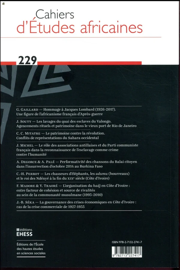
The rail plate
.rail-plate is the same plate set at the head of a metadata rail — the cover, scan or venue photograph that opens the apparatus. It adds nothing to .plate but the freedom to scale: the image takes the rail's 380px, or the full column once the rail dissolves under --lg. Every record rail on the site opens with one.

The missing plate
When the bytes never arrive, use:plateFallback gives the enclosing figure .plate--missing: the box stays, the image and its numbered caption go, and a centred .plate--missing-note states the fact in the data voice. A caption describes a plate, and a broken-image glyph sitting under “Fig. 1. …” numbers a figure that is not there.
Image unavailable.
§ 8 — Spacing & motion
An 8-point rhythm carries the density scholars expect — structured information over whitespace. Motion is near-zero by design: instant state changes, at most a short fade on page enter. The register is print, not app.
Semantic spacing
Durations
§ 9 — Colophon — where the system lives
Three families, one for each voice, all three under the SIL Open Font License and served from this site rather than from a font network. They are subset per script and instanced to the weight and width ranges the system actually sets, which is why the whole typographic programme costs four files.
Archivo — Display
A grotesque drawn for newspaper headlines and high-performance typography, with a width axis this system runs from 100 to 125. It sets the nameplate, h1–h3, section heads and the big data numbers.
Omnibus-Type · SIL Open Font License 1.1
Newsreader — Prose
A news serif with an optical-size axis and full Latin Extended coverage, which is what a corpus of French and English scholarship on West Africa actually needs. It sets all prose, h4–h5, standfirsts, captions and every italic.
Production Type · SIL Open Font License 1.1
Spline Sans Mono — Data
The data voice: eyebrows, datelines, counts, navigation, filters, chips, DOIs, pagination and ledger keys. Never body copy, and never a page-wide treatment — a code-editor aesthetic is an anti-reference here, not an adjacent style.
Eben Sorkin & Mirko Velimirović · SIL Open Font License 1.1
Where the system lives
This page is the arbiter of what the system looks like; the files below are where it is written. A value printed here is read live from the first of them, so the two cannot disagree.
Adding an idiom
Put the class in ink-signal.css with the note explaining why it exists, and document it on this page in the same change — not the next one. That is not a convention held by goodwill: styleGuideCoverage.test.ts reads every class the stylesheet declares and fails the build if one of them appears neither on this page nor in a component this page renders. The gap it was written for had stood for three weeks with nothing to catch it.